

Here's a look at Tim's April Tag inspiration and a link to his step-by-step tutorial.
If you've already been following me, you know that I've been creating art journal pages rather than tags. I so desperately want to learn more in the way of art journaling, and what better way than to challenge myself with Tim's techniques on my pages each month? Sometimes it's tricky, because Tim uses metal embellishments and ribbon and such, which don't necessarily work in my journal, but his techniques certainly inspire, and that's what it's all about! So here we go with my April pages...

I didn't have some of the dies Tim used on his tag (still waiting on my order) so I improvised with stuff in my stash.
Let me take you through my process. Keep in mind I'm no art journaling expert. Just a dabbler at this point.

I started with my practice journal which is the small art journal from Ranger by Dyan Reaveley. I stamped randomly (School Desk) with black archival ink across both pages. I don't cling the stamp to a block, just pick up the rubber in my hands and sort of roll it onto the page.

I left a little open space to stamp the dragonfly in the lower right corner.

Then I stamped the compass in the upper left corner in an open space. See the big black blob below the compass? That's where I masked out the bottom portion of the compass stamp with some scotch tape, inked the stamp up, then forgot to peel off the tape before stamping in my journal. Doh! Thank goodness this is my practice journal. And this is precisely WHY I have a practice journal. No need to freak out over little mistakes. I can always learn from those and make another set of pages in my real journal. Or perhaps fix it later. I then spritzed my pages like Tim did with the marker spritzer and some water.

After drying the pages, I blended Antique Linen Distress Ink toward the inside of the pages first.

Then some Old Paper, working my way outward.
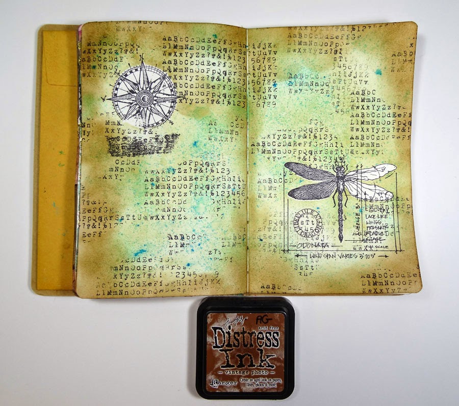
Vintage Photo around the outer edges.

Then a final rubbing of Walnut Stain. Such depth this creates! I finished this step with a big ol' spritz-and-flick of water around the pages.

I was curious to see how the watercolor effect would take straight onto my journal pages. No gesso, just the pages. It worked out pretty well, but just not the same effect as with watercolor paper.

Overall, I'm happy with it though.

Initially, I took a Gathered Twigs marker and traced the outlines of the circles in Tim's Splotches stencil. Just the lines were okay, but I decided they needed filling in, so I swirled Vintage Photo Distress Ink with blender into the stencil. I really like how the outline and the fill in are slightly different shades of brown. Gives it a cool effect.

After examining my pages, I decided I needed a bit more red pulled in to my design, so I grabbed some Red Geranium archival ink and stamped some harlequin patterns randomly. I also stamped some flourishes and postscripts (French Market) with Potting Soil archival ink.

I love Tim's new Big Chat stickers, so I decided to work them into my message on the right page. I created the Life Is on the left page with die-cut letters and black cardstock to sort of mimic the Big Chat stickers. I added a soft shadow with Pumice Stone around the stickers and my pages are complete!
So the question is, do I even need to recreate these pages in my "real" journal? I'm pretty happy with these, and as you can see, I covered up my boo-boo with the LIFE sticker. I think I've answered my own question.
Thanks for stopping by today. I appreciate all my blog followers and your lovely comments. You are what keep me creating!
This is your "practice" journal?! It's stunning! And I would never have known that you made a mistake with the tape if you hadn't said anything. Love the pop of red, how you colored the dragonfly wings and the circle stencil. Think I'm going to have to get that one. Heck...I like everything about these pages. Again, thanks for sharing the tutorial. I swear i'm going to break mine out and actually get started with my "practice" journal. ;)
ReplyDeleteYour art journal is a beautiful adventure. I agree with Tamytha, I love everything about these pages too. Thanks for sharing all the photos of your steps. Wonderful!
ReplyDeleteLove these pages, Annette. Those pops of red are brilliant!
ReplyDeleteWow - you inspire me!!!!!
ReplyDeleteAWESOME!! This is gorgeous Annette, and I loved watching your process! Amazing stencil work and the splashes of red really bring the page to life! hugs :)
ReplyDeleteYou definitely answered your own question! This is amazing Annette - and as someone who would love to be able to journal - it looks like you have been doing this for years! It really is beautiful. Anne x
ReplyDeleteAnnette, I love your journal pages; it looks like you've been at this craft for ages! I certainly think you nailed it with your "practice" journal! Love the colors and a lovely composition!
ReplyDeleteYour journal page is lovely - isn't it fabulous the way Tim's colours all blend together?
ReplyDelete