"Friendship" is what it's all about this month with this beautiful February stamp of the month set. Check out the image in the right hand column of my blog to see all the beautiful images and phrases in this versatile set aptly named "Friendship." So many possibilities!
Which brings us to the Stamp of the Month Blog Hop. Either you are already hopping and came here from Susan Brooks' blog or maybe you've just started here. Either way, have fun! There are over 60 consultants participating in this blog hop, so there's sure to be a wide variety of ideas and inspiration for you! Keep scrolling through my post to see my designs, then I'll show you where to hop next.

My first design is a 5 x 7 card. This has an elegant neutral tone with black accents. This photo doesn't do the ribbon justice. I hope you can see it better when clicking on it. It's Close To My Heart's newest ribbon addition. While I think it should be called "pleated ribbon" they have decided to call it "Wings Level 2 Assortment." It's a great twill ribbon that's box-pleated, then stitched down the center. It comes in a pack of three colors: Black, Juniper and Vineyard Berry making it a perfect match with the new "Wings" paper pack.

The top of the card is stamped onto Vanilla Cream cardstock. First the sentiment is stamped in black ink, then the large flourish emblem with Versamark and clear embossing powder. After heating this to set the embossing, I softly swirled black with a sponge dauber over the surface. I went back over that with Parchment ink and a sponge dauber, the wiped the excess off the embossed area. This served as a nice resist technique.

The bottom portion of the card utilizes two of the smaller flourish emblems to make a repeating background pattern. I stamped in black onto one of CTMH's new papers from the Bliss paper pack. I added some adhesive pearls from the Mocha Opaques collection. A few black pearls were also added to the top of the card. Those come from the Licorice Opaques.
A creamy button and some Bamboo and Black waxy flax embellish the ribbon. I had to use some E6000 glue to ensure that button never falls off.
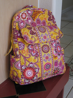
My second design is so completely different from the first, but I wanted to show the versatility of this set. My inspiration came from my Vera Bradley backpack. This is an older pattern from VB, but still one of my favorites for Spring which is already making an appearance here in Florida. As a Close To My Heart consultant, I am constantly seeing the world in the CTMH color palette. So while sitting in my kitchen one morning, I saw my bag sitting there and thought...
"Interesting...Sunny Yellow, Honey, Cotton Candy, Vineyard Berry and Pansy Purple with a little Smoothie too..."
Now that's quite a combination. Something I would never think to put together. Here is what I came up with...

This simple box came together in a snap, and was perfect for the background stamping that's ideal for this stamp set.

I started with Sunny Yellow cardstock cut to 8 1/2 x 11 inches, scoring as shown all the way across the paper.

I background stamped with Honey, then cut the two middle portions as shown to the score lines. These flaps will tuck inside the box when it folds up.

This is how it looks assembled. See the flaps in there? Really simple!

I punched this fun border out of Cotton Candy cardstock and adhered it around the box so the ends meet in the back.

The big flourish emblem on the front is paper pieced. I first stamped the main base image onto Colonial White with Pansy Purple. Then stamped three more of the same image using Cotton Candy, Smoothie, and Vineyard Berry, cutting pieces and parts from each as desired.

This certainly took some time, but I was happy with the results. I used my markers here and there to add some whimsy to the design, then finished off the top of the box with my favorite new ribbon from CTMH's new Pink Collection Designer Ribbon. This pom-pom fringe is Cotton Candy colored and easy to adhere with the same E6000 glue. Throw in some sweets and it's a perfect little gift bag for the perfect friend!
Thank you for stopping by. Now continue on the hop for more great ideas and inspiration. Visit Mary Eisen's blog next and see what she's come up with.
And don't forget, all the new products are now available (Feb. 1st) so ask your CTMH consultant or order online with me anytime.
Here's everyone in the hop this round for a quick look...http://stampingintheopen.blogspot.com/2011/01/february-stamp-of-month-blog-hop.html
Which brings us to the Stamp of the Month Blog Hop. Either you are already hopping and came here from Susan Brooks' blog or maybe you've just started here. Either way, have fun! There are over 60 consultants participating in this blog hop, so there's sure to be a wide variety of ideas and inspiration for you! Keep scrolling through my post to see my designs, then I'll show you where to hop next.

My first design is a 5 x 7 card. This has an elegant neutral tone with black accents. This photo doesn't do the ribbon justice. I hope you can see it better when clicking on it. It's Close To My Heart's newest ribbon addition. While I think it should be called "pleated ribbon" they have decided to call it "Wings Level 2 Assortment." It's a great twill ribbon that's box-pleated, then stitched down the center. It comes in a pack of three colors: Black, Juniper and Vineyard Berry making it a perfect match with the new "Wings" paper pack.

The top of the card is stamped onto Vanilla Cream cardstock. First the sentiment is stamped in black ink, then the large flourish emblem with Versamark and clear embossing powder. After heating this to set the embossing, I softly swirled black with a sponge dauber over the surface. I went back over that with Parchment ink and a sponge dauber, the wiped the excess off the embossed area. This served as a nice resist technique.

The bottom portion of the card utilizes two of the smaller flourish emblems to make a repeating background pattern. I stamped in black onto one of CTMH's new papers from the Bliss paper pack. I added some adhesive pearls from the Mocha Opaques collection. A few black pearls were also added to the top of the card. Those come from the Licorice Opaques.
A creamy button and some Bamboo and Black waxy flax embellish the ribbon. I had to use some E6000 glue to ensure that button never falls off.

"Interesting...Sunny Yellow, Honey, Cotton Candy, Vineyard Berry and Pansy Purple with a little Smoothie too..."
Now that's quite a combination. Something I would never think to put together. Here is what I came up with...

This simple box came together in a snap, and was perfect for the background stamping that's ideal for this stamp set.

I started with Sunny Yellow cardstock cut to 8 1/2 x 11 inches, scoring as shown all the way across the paper.

I background stamped with Honey, then cut the two middle portions as shown to the score lines. These flaps will tuck inside the box when it folds up.

This is how it looks assembled. See the flaps in there? Really simple!

I punched this fun border out of Cotton Candy cardstock and adhered it around the box so the ends meet in the back.

The big flourish emblem on the front is paper pieced. I first stamped the main base image onto Colonial White with Pansy Purple. Then stamped three more of the same image using Cotton Candy, Smoothie, and Vineyard Berry, cutting pieces and parts from each as desired.

This certainly took some time, but I was happy with the results. I used my markers here and there to add some whimsy to the design, then finished off the top of the box with my favorite new ribbon from CTMH's new Pink Collection Designer Ribbon. This pom-pom fringe is Cotton Candy colored and easy to adhere with the same E6000 glue. Throw in some sweets and it's a perfect little gift bag for the perfect friend!
Thank you for stopping by. Now continue on the hop for more great ideas and inspiration. Visit Mary Eisen's blog next and see what she's come up with.
And don't forget, all the new products are now available (Feb. 1st) so ask your CTMH consultant or order online with me anytime.
Here's everyone in the hop this round for a quick look...http://stampingintheopen.blogspot.com/2011/01/february-stamp-of-month-blog-hop.html
LOVE your work Annette! Gorgeous card and an adorable bag - that pom pom ribbon is so fun!!
ReplyDeleteLove the elegance of the card, and the "wow" of the bag! Awesome job as usual Annette!
ReplyDelete"Different" is right! LOL But they are both absolutely stunning...as usual!
ReplyDeleteGreat creations. Great tutorial.
ReplyDeleteLove the Vera inspired bag! Good job on the tutorial. - Dana W.
ReplyDeleteAmazing
ReplyDeleteGreat idea to clear emboss the large image over the top of the sentiment. And your Vera inspired card looks fabulous too. Certainly lots of cutting!
ReplyDeleteBeautiful!!
ReplyDeleteLove your card and the paper pieceing is fab. Thanks!
ReplyDeleteLeave it to you, Annette! The card is gorgeous and the bag is way over the top! Congrats!! Ellen
ReplyDeleteI'm using the damask style stamp to decoupage my coffee tables. We have super cheap tables from Ikea, and they need updating :-) I love the black and white card, its very elegant!!!
ReplyDeleteOh, I love both of these. I especially love the neutrals on the first card!
ReplyDeleteWow, what amazing artwork! They are both just incredible.
ReplyDeleteThey are both incredible and incredibly different from each other! The first card is GORGEOUS and the gift bag is ADORABLE!
ReplyDelete